What Happened
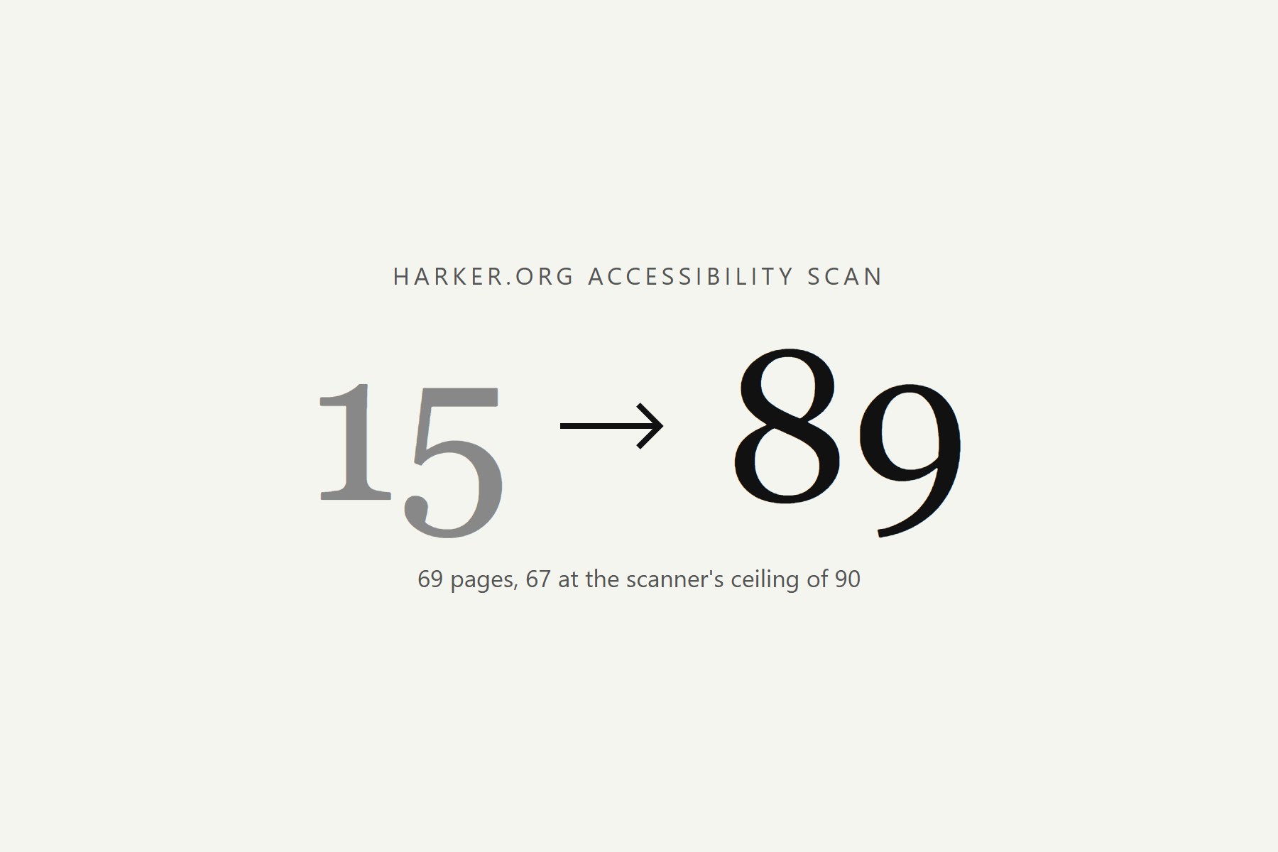
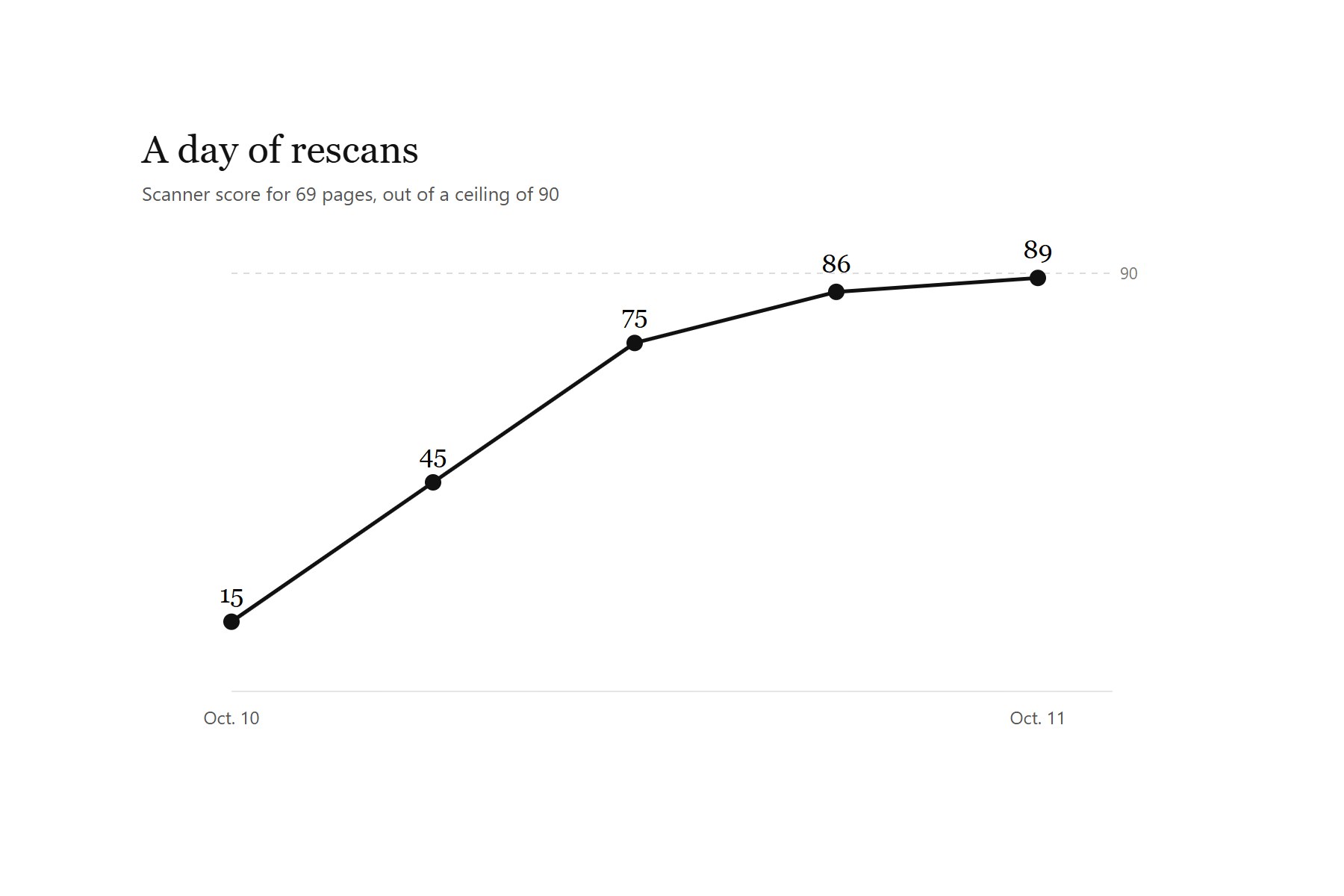
An outside accessibility scan gave harker.org a 15 out of 90. That’s a rough number for a school website, and it was clear it was time to address it. After digging into the results, I realized most of the problems lived in the shared theme and scripts, which meant one fix could reach every page at once. I kept fixing and rescanning until the score hit 89.
What I Changed
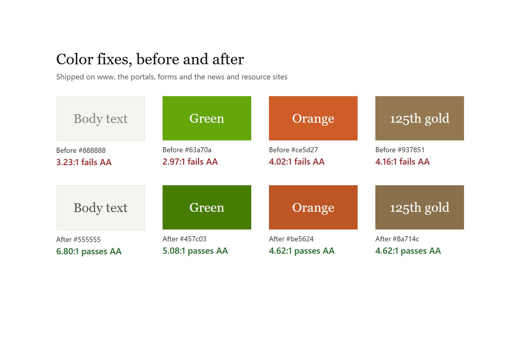
- Gray body text went from a contrast of 3.2:1 to 6.8:1, and I moved the orange, green and gold accents to shades that pass AA.
- A soft gradient behind the top nav brought every hero page above 4.5:1.
- The feature sliders, the flip cards and the MORE menu all work from a keyboard.
- In the end, 67 of the 69 pages sat at the scanner’s ceiling of 90.
The last five problems sit inside third-party embeds and platform code I can’t change.
The Scan
Once I looked closer, most of the level-A problems came down to two sitewide bugs: a search close link with no name, and a script that put the same id on almost every page. The contrast problems were real, too. White nav links sat right on top of hero photos, and most of those pages failed.
The Fixes
The new colors went out across www, the portals, forms, and the news and resource sites. On the UX side, it was important to me that every page worked from a keyboard, so I took hidden links in the sliders and the MORE menu out of the tab order, gave the flip cards a keyboard path and a focus ring, and gave every video hero a title.
 (full size)
How I Tested It
I handed the fixes to AI coding agents the way I’d hand them to a staff developer, and I decided what changed. Before each upload, I swapped the edited stylesheet into live pages to make sure nothing got worse. I also measured nav contrast from the actual pixels behind each link, because the photo under each link isn’t in the stylesheet.
 (full size)