Web Design: Corporate Redesign
Project Summary
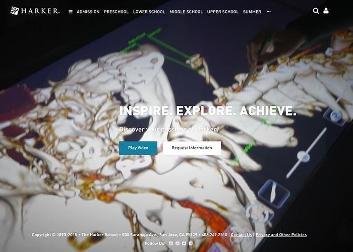
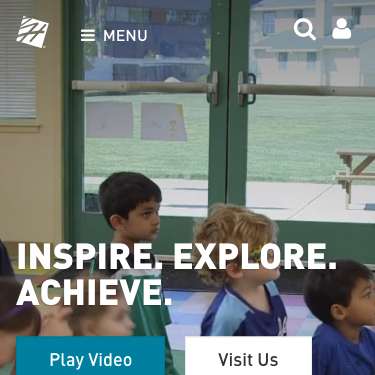
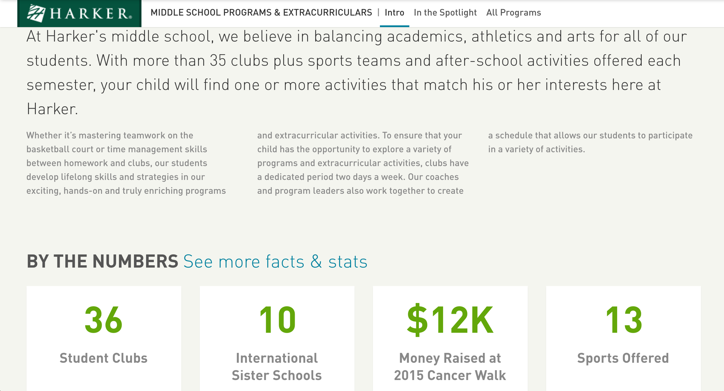
With a recently launched new division and a slight pivot in the school’s business strategy, I seized the opportunity to design a new responsive website that was lead by a robust, user-first content strategy. This project helped me develop a profound understanding of building large-scale content strategies that assisted the school in the management of marketing communication across all platforms.
Project Highlights
- a discovery phase that let me better understand how prospective families perceived the school and where the gaps in digital communication between those perceptions and how the school wanted to be perceived.
- building user personas and flows of our target users helped me design a bold, new information architecture.
- varying design deliverables were used to determine a final direction that lead to a vibrant and award winning design.
The success of the project hinged on my ability to lead teams, deadlines and meetings, conduct data collection and analysis, manage group and individual tasks and design a vividly communicative website that had buy-in from stakeholders while satisfying user expectations. I was responsible for directing the visual harmony and rhythm reflected throughout the website, which included the design’s video and photography.
Industry Awards
This web design was a MarCom Platinum winning website.
Project Details
Content Strategy Process
- As part of the discovery process, a review of data and collected documents was conducted to help build personas and map possible solutions for strategic concerns.
- Stakeholder interviews were conducted, that discussed topics including: overall messaging, new prospective audiences and the current state of the website. The interviews helped discover gaps in messaging that needed to be addressed.
- A content inventory was organized to help build a clearer picture of what pages were most visited by non-community members. This was later used to reinforce the new information architecture.
- A competitive review of local competitors was conducted and revealed how their websites told their stories.
- Personas were built, using the documentation gathered during the discovery, that highlighted four different types of users that our content strategy was focusing on.
- Journey maps were outlined to show the motivations and content that our personas were seeking out.
- Supported by data collected both qualitatively and quantitatively, an information architecture was built around the idea that each user persona was ultimately interested in the content related specifically to their children.
Design
Only after the completion of the content strategy was the following conducted:
- varying ideas were white-boarded, wire-flowed and later transferred to paper sketches.
- after direction was decided upon, sketches were made into higher fidelity mock-ups and working prototypes that showcased the responsiveness of the new designs to stakeholders.
- decisions around color, typography and other key elements of the design.
Pre- & Post-launch Analysis
After benchmarking, I targeted conversion goals related to our business objectives. Increases in traffic such as a 29% growth in prospective families visiting the admissions pages and an 18% increase in admission goal conversions over previous year’s goal conversion numbers were some of the major accomplishments of the project.


