Web Design: Constituent Portals
Project Summary
Over 63% of our users are internal and it had become clear that it was time for us to address our intranet. After looking at the data and conducting interviews with some key stakeholders, we realized that our low success rate was mainly attributed to a few key issues: the number of links we were hosting, the organization our information and an inability to search for rarely used resources. These issues were consistent across all user groups.
After gathering data both analytically and through usability studies, we decided that building a tool to manage the overwhelming number of resources would give us the opportunity to streamline the top priority actions on our intranets.
Goals of the Project
- Increase user success rate from 65% to 75%+
- Reduce link bloat
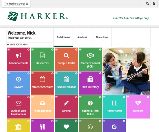
- Increase visibility of high-priority actions
- Improve information architecture
- Build a resource tool that is searchable
- Introduce design consistency to reduce confusion around transference between sections, pages or products.
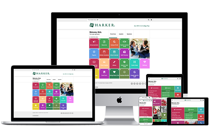
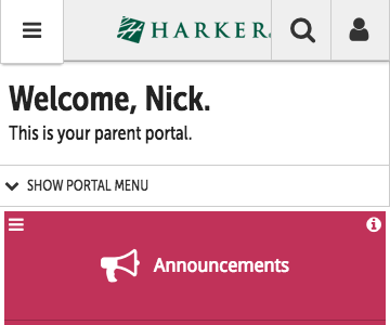
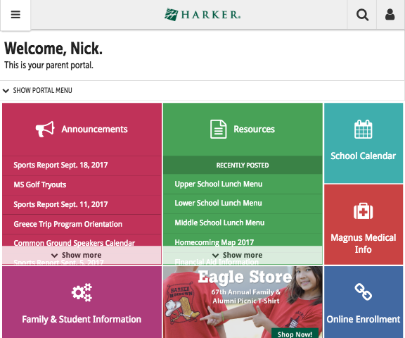
- Deliver a design that was responsive on all devices.
Project Highlights
- Opportunities to interview and study users from discovery through launch allowed me to better understand where we needed to focus and re-adjust our design strategy. It also gave us the confidence that the user success rate was moving toward our goal throughout the process.
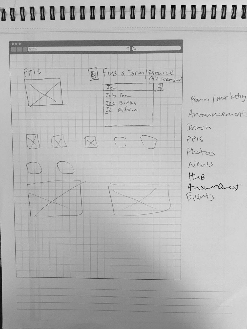
- By introducing a new resource tool that harnessed live filtering, users were able to now search for the resources they needed using a variety of different methods.
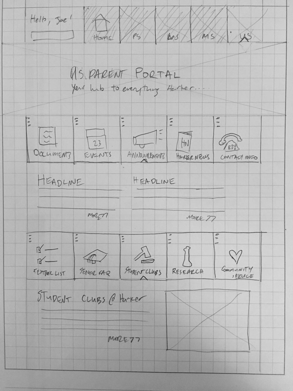
- Reducing link clutter on the landing pages, gave users fewer options to navigate through and increased the visibility of their most used and important actions.
Pre- & Post-launch Analysis
When we started into this project, it was important for us to understand why users had difficulties finding what they needed. After a round of usability testing and interviews, we discovered that the most of the issues revolved around the large number of links each screen contained. The average number of links on any given intranet screen had ballooned to 50, with one of the screens containing over 80 actionable links.
Our goal was to reduce the number of screens and actions per a screen. We settled on a goal of a maximum 3-5 screens per user scenario and no more than 20 actions per screen. To decrease the numbers that dramatically, we first used data and user feedback to determine which actions were most important to each user group. Then, we were able to reduce it even further by building groupings of links on our new resource tool. This gave us the flexibility we needed to add new actions to screens without sacrificing our action goal, and it helped deliver an easy to use, responsive design that, in our most recent tests, averaged an over 80% success rate.
